COLOUR THEORY PROJECT DEVELOPMENT
COLOUR-BASED DEVELOPMENT EXERCISE
In week four, we were tasked to develop ideas using colour. This is because, with the use of colour, you can view your initial ideas from varying perspectives, enabling you to shortlist the colour schemes you are most likely to use for your project. For this task, I used four sheets of paper with the printed design I selected. I then used the four colour schemes in the brief which are polychromatic, analogous, complimentary and split complimentary colours.
The first colour scheme I tried was monochromatic. Yes, I made a big mistake when I read the brief. I mixed up polychromatic with monochromatic and ended up with this. A monochromatic colour scheme is varying shades of one colour.
I began by using the lightest shades of green to colour the edges of the glass windows from the apex to the base of the building. I then proceeded to draw the doors using a dark maroon-green colour. These doors are manual doors which do not have any security features installed in them. Afterwards, I drew the plants using a mid-tone green. The final part was to colour in the roof using the light green colour. I admire the way I was able to blend in the different shades of green to produce a realistic outcome. However, I don't see myself working with this colour scheme.
The second colour scheme I used was analogous. Analogous colours are colours that are next to each other on the colour wheel. I began by using blue to colour the edges of the glass windows. I then used blue to highlight the base of the building's sides. Since I used analogous colours, I used a green marker to draw creeping plants on the balcony rails. This was to incorporate a natural environment into ultra-modern living. The doors leading to the balconies were drawn using a silver-coloured marker. These are double doors which can be easily opened and are installed with high-security censors to prevent burglaries. This design is my favourite out of the rest because of how realistic it looks.
For the third colour scheme drawing I used complimentary colours. Complimentary colours are those that are directly opposite each other on the colour wheel. I used purple and yellow which you can see in the picture. I would describe this as an inverted colour scheme due to the unrealistic shades I used. I used pink for the windows as I did in the previous sketches. I also used the colour yellow for the creeping plants on the rails of the building. This one in particular was just an experiment with colours because this colour combination is not my style. I prefer more laid-back and cool tones with the building standing out as the main design and eye-catching feature. The doors in this are also security installed but it is a single door leading to the terrace. I don't think I will use this in my main project idea but it was a good practice session.
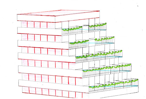
Finally the last piece. In this drawing, I used split complimentary colours. Split complementary are colours on the direct sides of one complimentary colour plus the other complimentary colour. On the colour wheel, the complimentary colours for this would have been red-orange and turquoise-green. But to obtain the split complimentary I maintained red-orange and picked green and blue which are on the left and right sides of turquoise on the colour wheel. I used the same methods I used in the previous sketches by using the main colour which is red to colour in the windows and the sides of the building. I also used green to draw handing creeping plants which is quite different from the previous three sketches. I used the colour blue to draw a metallic line which crosses the terraces on the five floors. I don't think I will use this design in my final project because I do not like the dominance of the red in the building. The only feature I like is the overhanging creeping plants on the terrace.
To conclude, out of the three designs I will opt for the third which seems more realistic. It also fits the objective of my project which is to create a modern environment infused with a natural landscape. The blue in the drawing represents glass windows and the green on the terrace represents the creeping plants. In my future blogs, I will elaborate more on the features.


Now that you have adjusted your designed based on our conversation in Week 7, please follow this up with a post on how the design has been altered.
ReplyDelete