Posts

FINAL REFLECTION

Image
            REFLECTING ON THE MODULE All too soon the Art Portfolio module and my time at DMUIC has come to an end. This reflection post will be based on Art Portfolio One and Two as well as what I have learnt and improved on as an outgoing DMUIC student  Art Portfolio two started about 10 weeks ago. I was quite excited for the second segment of the Art Portfolio subject so I checked the brief even before school started. I went through my brief and was a bit startled and scared. But I told myself I will take on this challenge head on because I did not want to end my final term on a bad note.  In my Art Portfolio 2 brief I was tasked to design a social housing unit for the residents of New Cromwell because the town was burnt down due to a terrible fire. Right away I knew that I wanted my main Architectural style to be Ultra modern infused with greenery. According to my brief I was supposed to engage in idea generation which I believe was the most difficult aspect for me I did multiple i

WIX- FINAL WEBSITE UPDATES

Image
      FINALIZATION OF WEBSITE DESIGN AND LAYOUT  After completing all my design boards the next and final thing I needed to do was to post my design boards and alter the layout to my taste and standard requirements  To follow up on the first Website update post I decided to change the home page wallpaper. The one in the image above was outdated because it is an image of my Art Portfolio one project  In order to change it I tapped on the edit button on the left hand side of the screen. Afterward I tapped on upload media and selected the image I picked the image of my 3d model for the mean time.  In the first Website updates post I used a place holder for my third project because I was not sure of what image to use. I finally decided on an image that will continue the sequence of the sketch up project images on my portfolio page. To add the image to the page I double tapped on the previous image to replace it. Afterwards I uploaded the new one to replace the old image and finalized it by

PHOTOSHOP FOR DESIGN BOARDS

Image
 PHOTOSHOP DEVELOPMENT In Art Portfolio One, I learnt how to use Photoshop. This term I had the liberty to pick from other design board software's but I still used photoshop because it is widely used in the design industry.    Since I am starting a new design board series I selected the New File button on the left side of the    screen                       I then selected the A3 sheet and changed the orientation to landscape and clicked on create.  I then searched for a copyright free image on Unsplash but I did not like this image. For my final Art Portflolio design boards I wanted a pastel colour but I did not know what exactly I wanted  At that moment in order not to waste time I decided to start with the texts while I delibrate on the colour I wanted.  I then decided to use my concept image as the background, reducing the opacity and layering it with a pastel blue colour.  Afterwards, I began to develop all the design board by cropping imagesnand editing them when the need ari

4 BLOCKS CONCEPT WITH SKETCHUP

Image
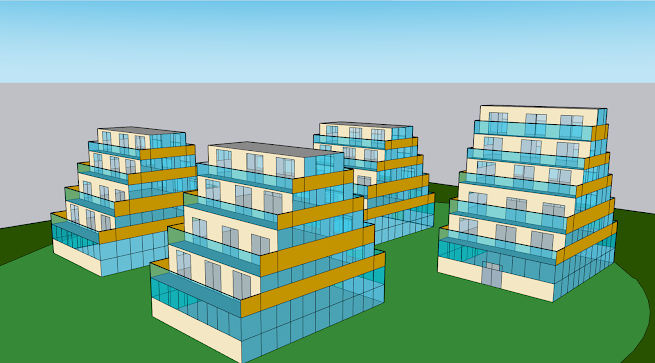
  SKETCHUP DEVELOPMENTAL PROCESS Sketchup is no stranger to me as I began using it during the Digital Art module in November 2023.  Because my sketches and outcomes were mostly based on block A, I wanted to also show  how the three other blocks would fit into the plan.  I began by laying out the land on which the buildings would be built. Afterwards, I used the rectangle tool to draw each of the four blocks. This was followed by me expanding them from a 2d plane to create a 3-dimensional shape.                              I applied the same process here till I had built all the floors required Bear in mind that Block A has 6 floors in total whilst the other 3 have 5. After completing the main shapes I then began to add colours and put in the glass windows using the tool tray. This was not difficult as I already know the basics of sketch up. I repeated the same process for the other blocks till I completed it  Alas, I had completed my SketchUp development. To recreate a grass landscape

GARDEN, PLAYGROUND AND PARKING WITH ROOM PLANNER

Image
 ROOM PLANNER FOR INTERIOR CONCEPTS Room Planner is an interior app used by designers to create concepts of living spaces, gardens, gyms etc. This was not the first time I used a room planner as I had used it earlier last year to complete my high school portfolio.  I made the personal decision in order to design the interiors because I dont only want to envision the exterior. I also want to design the interiors and take into consideration the internal design and aesthetics  The image above is of the home page interface of the room planner app. On it you can see the section for the garage, the outdoor space which is the garden and playground For the garage, I began by drawing the main ground for the garage. The garage is a 100 car capacity but I only designed the first level for this project. On the right you can see a black strip which is the road that leads to the garage.  The next thing to do was to switch up the interior colour. By default the walls are white but I changed the colou